While it can initially look intimidating, the process of reviewing a power file is actually pretty straight forward. While eventually you will come to your own workflow, here is an outline of the process I go through.
Starting the Process
For me, reviewing a workout typically starts with the Post-Workout Notification or the in app notification. By quickly glancing at the Post-Workout Notification email I can glean information such as; Did they do the workout? Did they do the prescribed time? What was their Intensity Factor® (IF®).
Looking at the IF can provide me with insight into whether or not they did the workout as prescribed, or if their threshold is set correctly. From the graphic below, you can see that an active recovery ride should be less than .55.
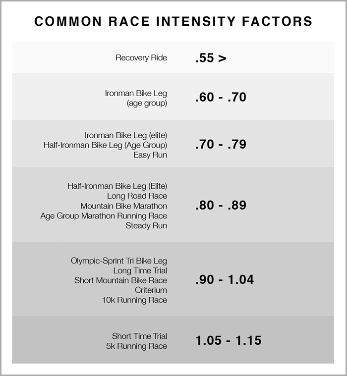
If I have prescribed a recovery ride and I get a Post-Workout Notification showing an IF of .67, that would tell me that the athlete went harder than directed. On the other hand, if I see an abnormally high IF, such as 1.2, for a workout that is longer than 30 to 40 minutes, this might be an indication that the athletes threshold is set to low. Once I have reviewed the post workout notification I can decide on my next action. If it is a key workout or race then I will launch the app and go into the workout so that I can analyze it.
Reviewing Power Files
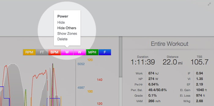
Power files can be very noisy with all of the channels displayed. The first thing I like to do is to ‘hide others’ by hovering over the power channel and then selecting Hide Others. Then I add back other pertinent channels such as altitude and maybe cadence or heart rate depending on what the athlete was working on that day by hovering over the respective channels and then selecting ‘show’.
The next thing I like to do is to go in and annotate each of the intervals with the power, cadence, and heart rate. In the case of this workout, the athlete recorded the laps on their device making my job easier. Now I can double-click on each interval which will not only highlight that segment in the file, but also make that field editable.
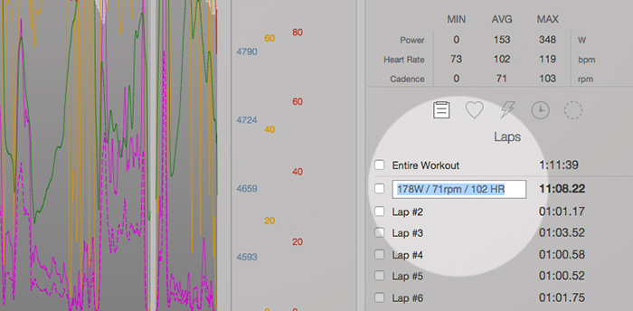
Once I have added the information that I am interested in, I might apply some smoothing so that I can more easily compare the intervals …or zoom in for a closer look. Finally, I might overlay zones by hovering over the power channel and selecting ‘show zones’. From here I can easily see which zone they were in for each interval. I can also cycle through the zones to isolate exactly what I am looking for.
Other Charts
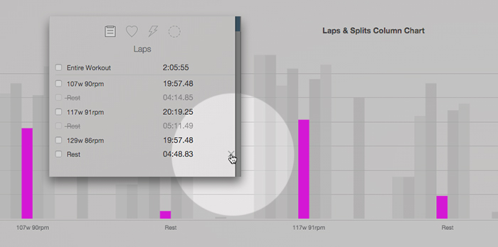
Once I am done looking at the graph I may add the laps and splits chart and then remove the rest intervals by clicking the ‘x’. This allows me to view the interval information right on top of each other for easy reference.
Next I might look at the Peak Power chart set to compare the over the last 90 days to see how today’s ride compared. This chart can also be set up as a grid if you prefer to look at this information that way, or want to display the data in different ways.
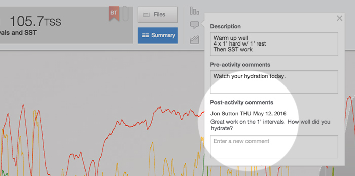
Once I am done reviewing the file I will leave the athlete a comment so they know how they did. For coaches, communicating with athletes is a critical part of keeping your athletes motivated and on track.
Following a few simple steps can get you started analyzing power files. As you become more experienced, you can tailor your own process to your priorities. Using this powerful data can help you train smarter and achieve your race day goals.

